
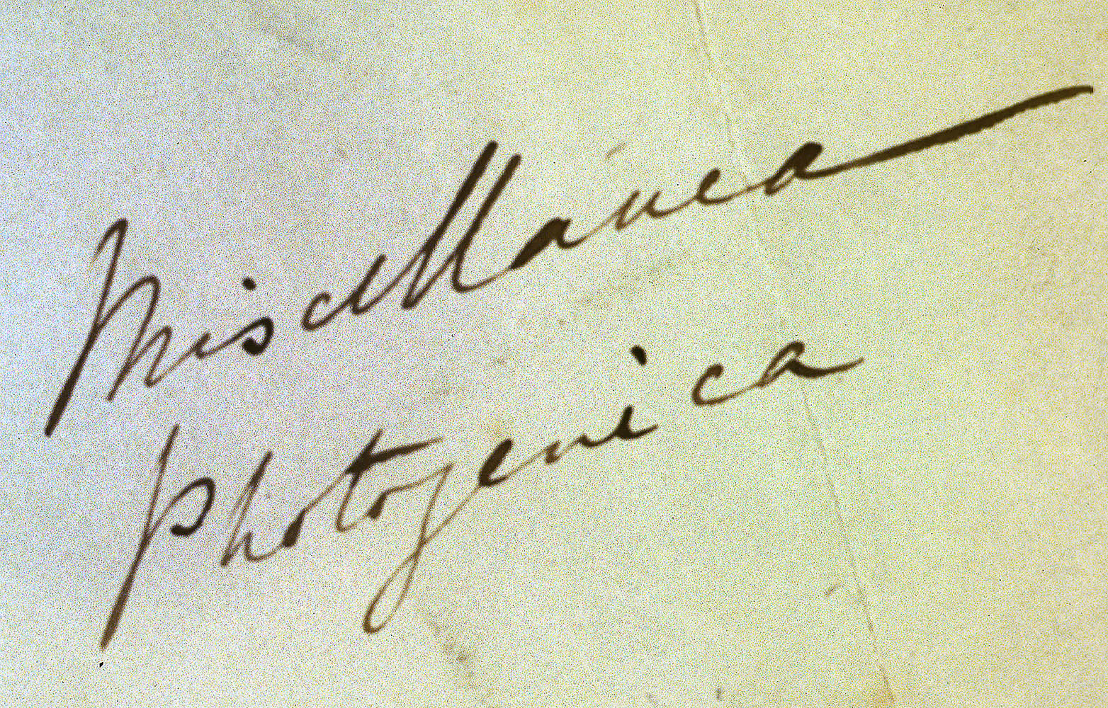
Some years ago a book of mine was inching its way towards actual publication. Coming up with titles is always a devilish process, but drawing inspiration from one of Talbot’s packet annotations, Miscellanea Photogenica (with a subtitle) struck me as the perfect choice. Alas, the workhorses in the marketing department were frightened by this use of a ‘foreign language’ and its cryptic message. A prosaic title was assigned by committee – the book came out great and I still take pride in it – but I’ve always wondered how it would have fared had Henry’s suggestion been allowed to prevail. So now I shall re-purpose this evocatative phrase periodically to gather together little morsels that appear mostly in response to previous blogs.
And then there were Twenty
Recently I marveled at the unexpected discovery of a nineteenth rendition of Talbot’s Bucker Fern, a splendid copy preserved in an album compiled by his sister-in-law, Emily Mundy. No sooner had I published this when one of our eagle-eyed subscribers, Dr James Hyman, gently suggested that the count really should be nineteen and a half.
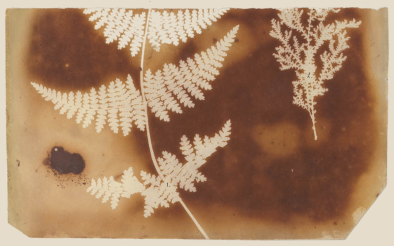
A component of the critical album compiled by Talbot’s Italian botanical colleague Antoino Bertoloni (1793-1869), this example is readily available publicly and was long known to myself. Certainly Bertoloni will feature in a future blog as one of Talbot’s ‘Intimate Collectors’. To the best of my knowledge, Bertoloni’s album was the first photographic purchase made by New York’s Metropolitan Museum of Art, acquired in February 1936 from the intriguing London bookseller E. P. Goldschmidt. This particular photogenic drawing was transmitted to Bertoloni by Henry’s favourite uncle William Thomas Horner Fox Strangways in August 1839. Why was it cut in half? I can only hazard the guess upon close examination that it is less sharp than many of Talbot’s photograms that the pressure glass was not sufficiently tightly in contact and that Henry (more likely) or Bertoloni (less likely) cut off a top half that was less than acceptable. In a way this demonstrates just how precious Talbot’s original negatives were becoming later in 1839 as demand for examples increased even while the engine of his process, the rays of the sun, were rarely to be seen in that first public year of photography. That was part of the reason that Henry began to follow his mother’s advice to make more prints, but for a botanist like Bertoloni Talbot would want to provide the primary iteration of an image, the original negative.
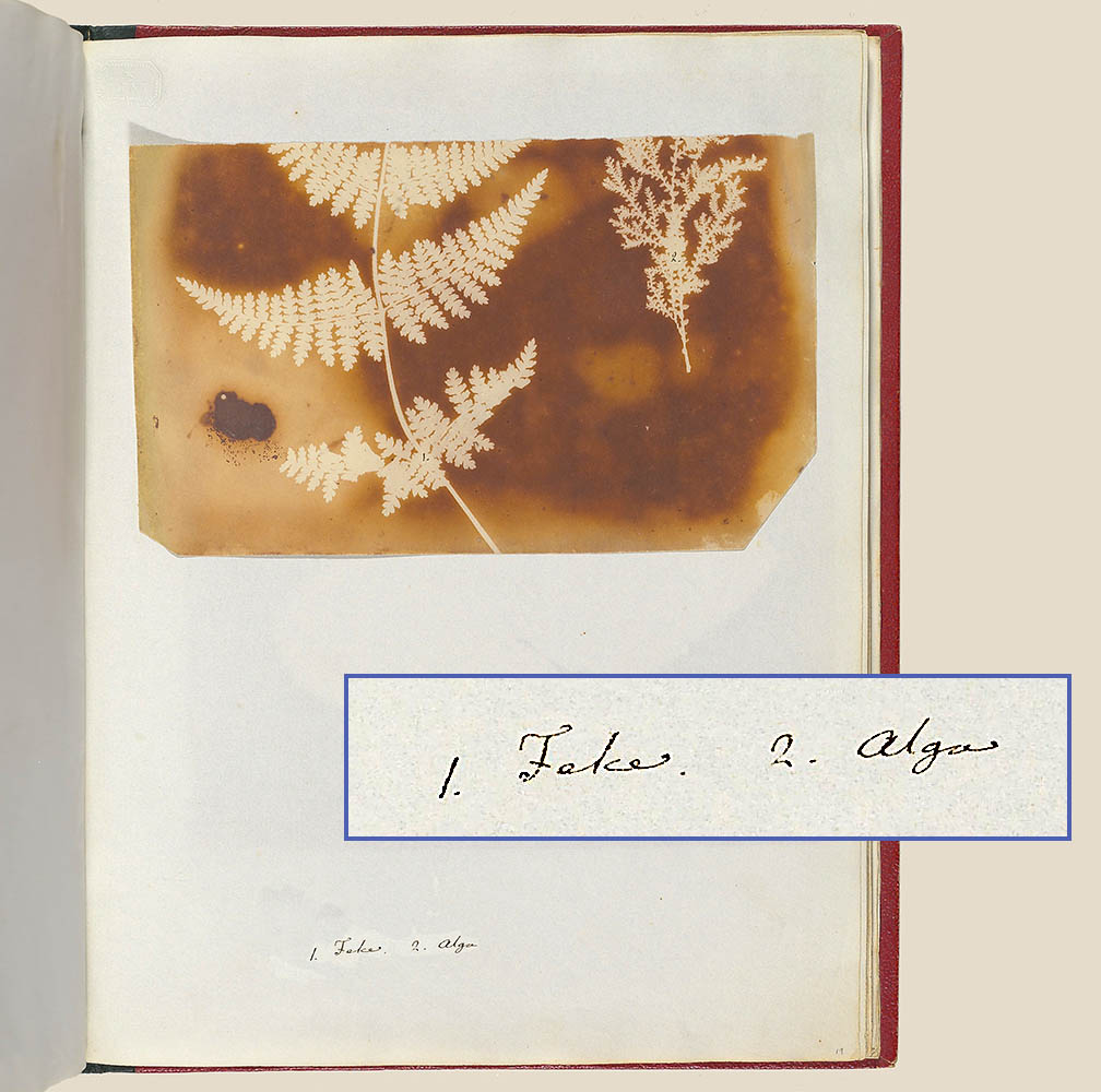 Now, the critical reader is bound to ask, how could you miss this familiar example in your tally of Talbot’s employment of the Buckler Fern? My feeble excuse will have to draw on the perils of literalness. My databases on which the upcoming online Catalogue Raisonné is based have been in development for four decades. In the early 1980s computing power and electronic storage space were highly limited and thus a controlling factor in my earliest records was economy of verbiage. When I searched for the key phrase ‘Buckler Fern’ the database took me at my word and produced the nineteen results published in the blog. Since the record of the Bertoloni was created more than twenty years ago, I had transcribed just Bertoloni’s “1. Felce.” without even adding the translation of fern, much less associating it as a Buckler Fern. These sorts of lacunae will be filled in the published version of the Catalogue, but for now they tantalize me with thoughts of what other really obvious connections have slipped from my porous memory over the years.
However, I must gently disagree with Dr Hyman on his suggestion to crown this example No. 19 1/2 . It fully deserves to be No. 20 in the series. Will there be more?
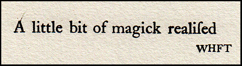
A Little Bit of Mischief Realised
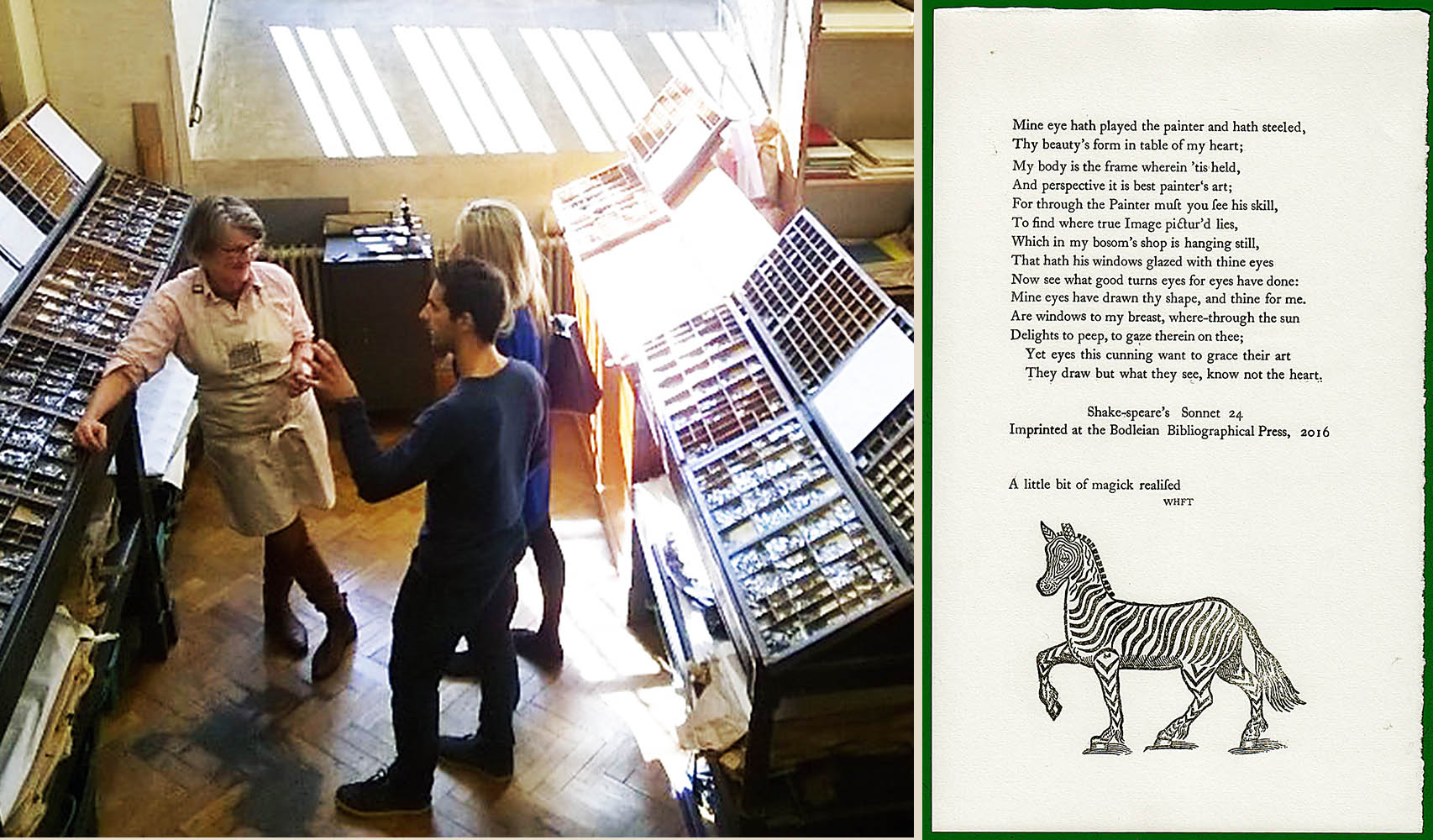
Earlier this year I was fortunate enough to secure a slot in the printing workshop of Oxford’s Bibliographical Press, located in the Schola Musicae just to the right of The Tower of Five Orders in the Old Schools Quadrangle. On this day we were contributing to the celebration of Shakespeare’s Sonnets, a continuing international project that is gathering together not only various forms of relief printing (ie, raised type) but also parallel contributions such as sonnets written by schoolchildren.
 Master printer Richard Lawrence patiently guided our not always nimble fingers in picking out type and arranging it artfully into the rack. It was a group effort with each of us contributing a line or three of type to be locked into the form to complete a sonnet. One of our amateur typesetters, with the approval of the group, rather capriciously added a woodblock of a zebra just because she liked the way it looked.
Knowing Talbot’s intimate connections with the world of printing, I just couldn’t resist slipping something in.
Dr Alexandra Franklin, Project Co-ordinator for the Centre for the Study of the Book, very kindly turned a blind eye towards my impetuous insertion. If you have another look at the sonnet above, by using a slight paraphrase of an arresting line from Talbot the worlds of photography, fine printing and the Bard were joined. Appropriately so, I might say. Talbot immediately realised the impact his invention would have on the world of books and his enthusiasm so infused those around him that Constance Talbot and Thomas Moore picked up on his lead. However, Talbot did pursue raised type, instead turning to methods of producing intaglio plates.
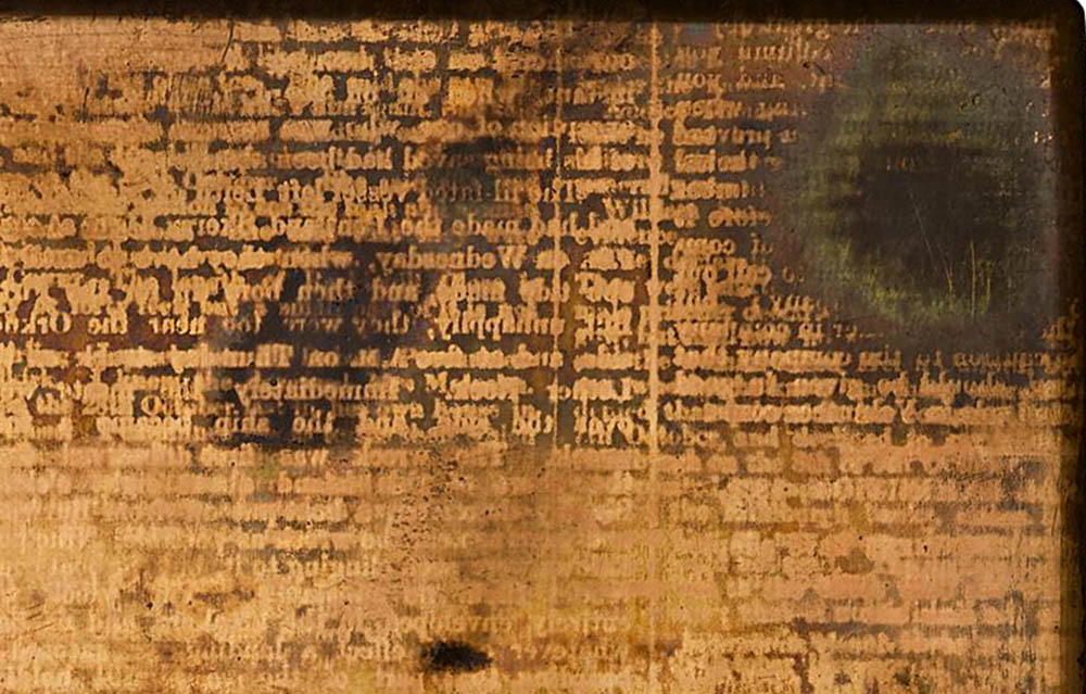 Detail of one of Talbot’s Photographic Engraving copperplates
His 1852 Photographic Engraving, 1858 Photoglyphic Engraving and subsequent Photo-Sculpsit processes paved the way for the successful merger of photography and the pages of the book.
A Tangle of Martyrs
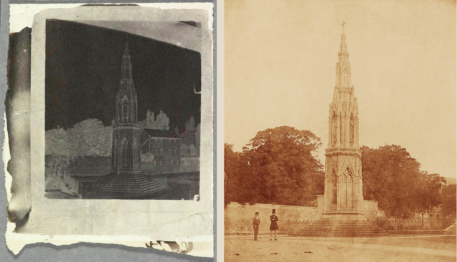
I had suffered through the tale on occasion before, but the frequency of the taxi drivers’ prank seemed to peak around 2005 when I was the Slade Professor at Oxford. Detecting an American accent (muddled as mine might be), the cabbie could not resist launching into the story of the church steeple struck by lightning so fierce that it was knocked off the roof and dropped to the street. Obviously respecting a sign of Divine intervention, the townspeople left it there.
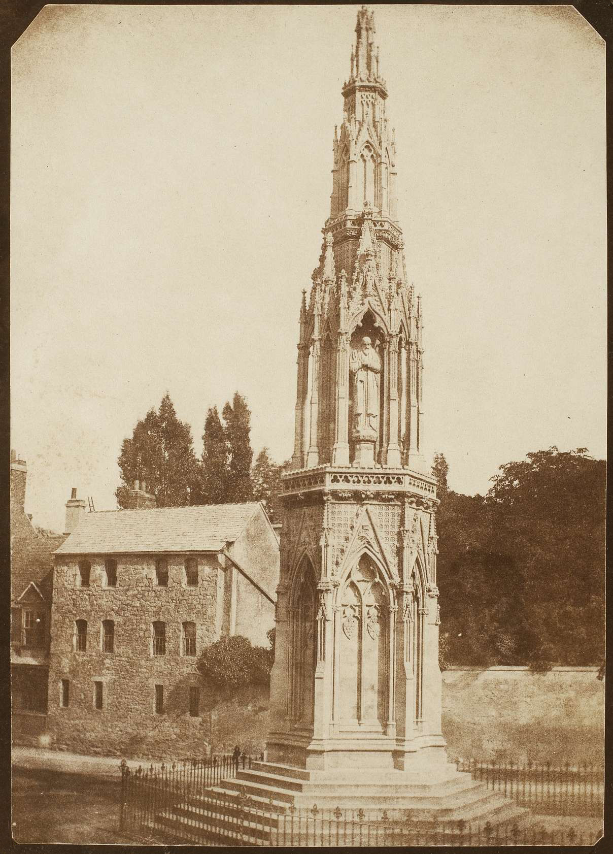
You may be familiar with this photograph (seen here in an untrimmed example) as plate 21 in The Pencil of Nature. For Harry Potter fans who have yet to visit Oxford, the monument is in the middle of a now busy intersection directly opposite the Randolph Hotel. For those conversant with Oxford, this familiar monument may look a bit out of place in Talbot’s 1843 photograph. Cesar’s Lodgeings just behind gave way in the 1850s to development and just to the right of this image the long front of the Salvin Buildings of Balliol College was erected.
This photograph of something that looks ancient but in fact where the mortar was still wet reminds us of Talbot’s great interest in the contemporary world evolving around him. Erected in the two years preceding this photograph, paid for by public subscription and built to Sir George Gilbert Scott’s design, the monument commemorated the three martyrs burned in the square in 1555 and 1556. With Nicolaas Henneman’s sometimes assistance, Talbot made it the subject of at least twenty-two of his negatives.
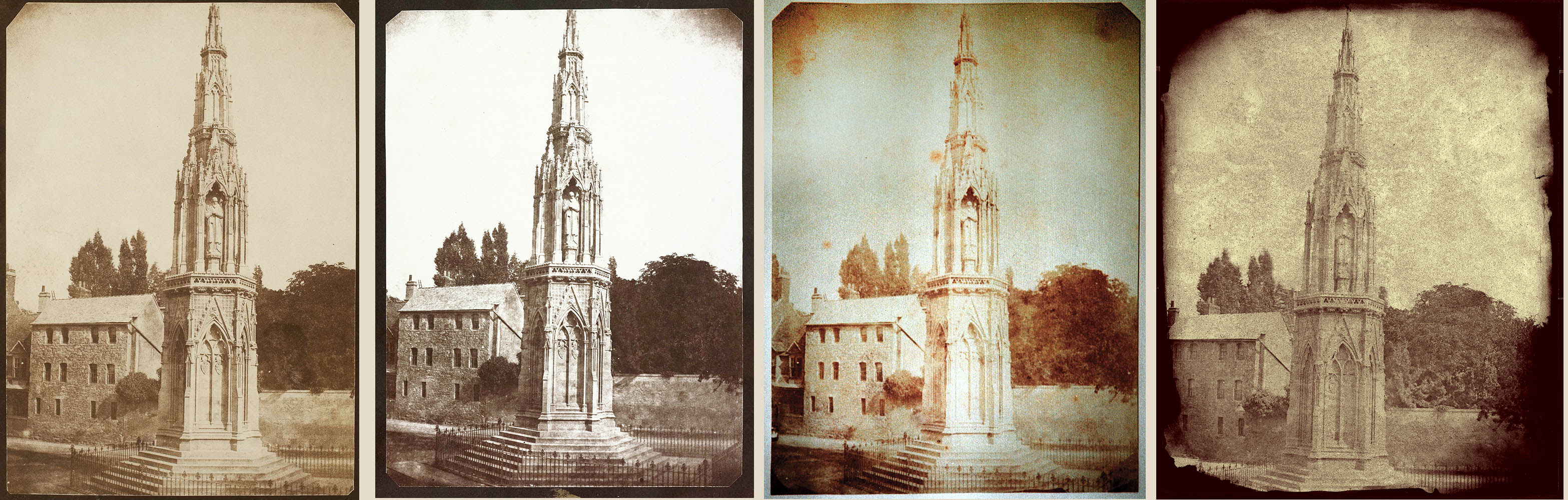
One of the goals of the Catalogue Raisonné is to link together similar images like this to facilitate associating scattered prints with each other and with their parent negative. But in bringing together similarities it also highlights differences.
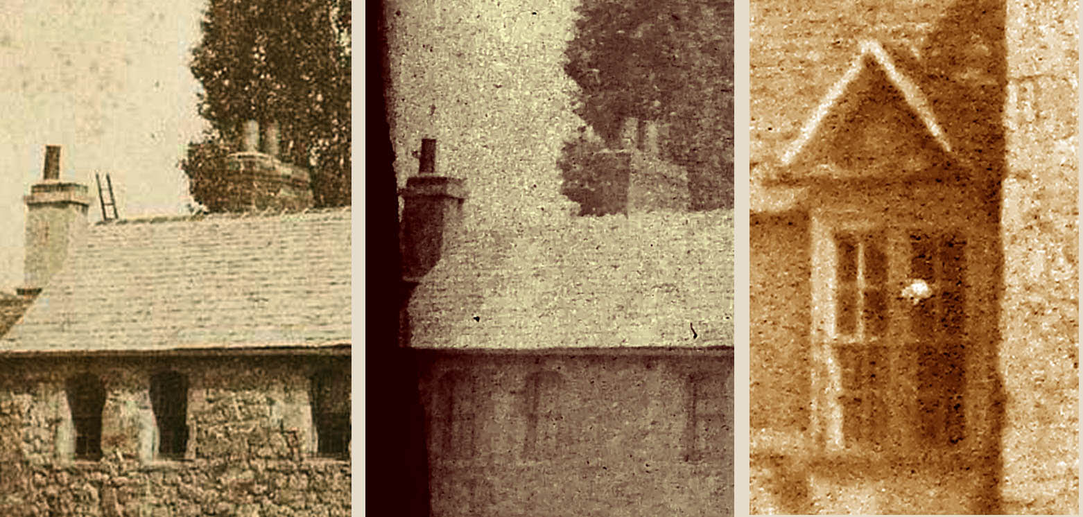
The first three renditions feature a ladder poking up above the roofline. The image at the right lacks this ladder and is also lacking in contrast and defined shadows. Did the workman take down his ladder in the face of an impending storm? Or, as is more likely, was the one on the right taken on a totally different day? And what of that nearly-defined white spot in the window? A maid shaking out a towel?
And then there are other variations for somebody to study. The intriguing negative on the left was almost certainly done under a glass pressure plate in the camera, probably exposed while the calotype paper was still damp and thus at the height of its sensitivity. In spite of Roger Watson’s efforts we still know far too little about Talbot’s equipment and many of his innovations. The negative for the image on the right was preserved in the collections in Lacock Abbey. A more conventional view of a monument with humans added for scale, was this the work of Talbot himself? Or as I feel, more in the style of his friend and colleague the Reverend Calvert R Jones? Bolstering that attribution is the fact that there is a rare hand-coloured print made from this, representing a brief but important experimental phase in Jones’s work.
Miscellanea Photogenica.
Larry J Schaaf

• Questions or Comments? Please contact digitalsupport@bodleian.ox.ac.uk • WHFT, 1. Felce 2. Alga (Buckler Fern & Algae), photogenic drawing negative, prior to 15 August 1839, Bertoloni Album, the Metropolitan Museum of Art, New York, 36.37 (21); Schaaf 2247. • For more on Bertoloni, see Graham Smith, “Talbot and Botony: The Bertoloni Album,” History of Photography, v. 17 no. 1, Spring 1993, pp. 33-48. • “A little bit of magic realised” was written by WHFT in his letter of 30 January 1839, published in ‘The New Art’, The Literary Gazette and Journal of belles lettres, science and art, no. 1150, 2 February 1839, p. 73. The full text is reproduced in the Talbot Correspondence Project Document no. 03782. • WHFT, Detail of a photoglyphic Engraving plate of printed matter, copperplate by D & J Greig of Edinburgh, ca. 1858. Talbot Collection, National Museums of Scotland, T1936-98-1. • A survey of WHFT’s efforts with photographic engraving can be found in my ‘The Caxton of Photography’: Talbot’s Etchings of Light,” in Mirjam Brusius et. al., William Henry Fox Talbot: Beyond Photography (New Haven: Yale University Press, 2013). • WHFT, The Martyr’s Monument, Oxford, salt print from a calotype negative, likely 7 September 1843. National Gallery of Canada, P75:008:04, Schaaf 1923. • WHFT, Four variants of The Martyr’s Monument: salt print, likely 7 September 1843, National Gallery of Canada, P75:008:04, Schaaf 1923; salt print, National Media Museum, Bradford, 1937-1277/1, Schaaf 3765; salt print, J Paul Getty Museum, 85.XM.150.6, Schaaf 1323; digital print from a calotype negative, National Media Museum, Bradford, 1937-1276, Schaaf 1922. • Detail of a salt print, National Media Museum, Bradford, 1937-1912, Schaaf 1923; detail of a digital print from a calotype negative, National Media Museum, Bradford, 1937-1276, Schaaf 1922; detail of a digital print from a calotype negative, National Media Museum, Bradford, 1937-1275, Schaaf 1923. • WHFT, The Martyr’s Monument, calotype negative, National Media Museum, Bradford, 1937-1790, Schaaf 1314; Calvert R Jones or WHFT, The Martyr’s Monument, salt print from a calotype negative, Private collection, Schaaf 1326.