
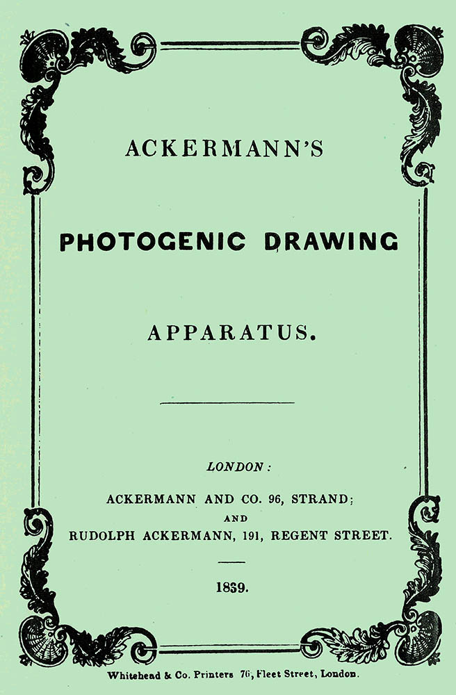
The firm of Ackermann & Co. grew from most unlikely roots. Rudolph Ackermann (1764-1834) was a saddler in Saxony before moving to London in his early twenties. This was the British centre of coach building and Ackermann soon emerged as a fine and inventive craftsman. Possessed of a flair for self promotion, in 1791 he published Imitations of Drawings of Fashionable Carriages in order to promote his wares. That led him into the new world of lithography and from there to stationery supplies and colours for artists. His growing firm began to publish the heavily illustrated Repository of Arts, Literature, Fashions and manuals for artists, including Léon Mansion’s Letters Upon the Art of Miniature Painting. His successors expanded the business further, so in 1839 it was natural that the firm became a purveyor of supplies for the new art of photography.
There are many curious or downright enigmatic photographs in Henry Talbot’s archive, most devoid of inscriptions and with few clues as to when or why they were made. No prints are known to exist for this diminutive calotype negative.
 Calotype negative – digital print

This sort of test, still being done in the digital age, will be familiar to many photographers. Talbot was a customer of Ackermann’s long before photography and he (or his wife or sisters) may have had this colour chart for their own watercolours. However, Talbot himself would have had little need for such a test, or indeed, for a watercolour chart at all. I think it more likely that the negative was done by Nicolaas Henneman in his photographic establishment at Reading.

 I’ve never been able to trace an original of this particular Ackermann’s display card. Surely one must have survived. If you know of a copy in a museum or ephemera collection please point me towards it.
Larry J Schaaf

• Questions or Comments? Please contact digitalsupport@bodleian.ox.ac.uk • The facsimile of Ackermann’s booklet illustrated was published by the Royal Photographic Society Historical Group in 1977. • Attributed to Nicolaas Henneman, Copy of an Ackermann’s Colour Chart, calotype negative, mid-1840s, National Science and Media Museum, Bradford, 1937-4302, Schaaf 4289.